“Your website is the window of your business. Keep it fresh, keep it exciting.” – Jay Conrad Levinson
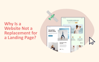
Do you know what stands out in a competition-driven marketplace? Traffic. The attracted eyes falling for your products and services through your website. But what happens when you attract customers and yet they don’t end up buying? This lack of conversion is a sign of wasted potential. A conversion-optimised landing page is the difference between ideation and execution. From lead generation to newsletter sign-ups, a landing page drives the audience that visits to stay.
Why Landing Pages Matter
Just like a website is the digital address of a business, a landing page happens to be the front door that a visitor enters through at a glance. A landing page is more intentional than a homepage, focused around a product, service or a campaign.

A well-structured landing page helps in these following ways:
- Accelerate ad ROI by supplying progression from ad copy to page content.
- Providing the apt information, it significantly lowers the bounce rates.
- Constructs a trustworthy relationship through relevance, clarity and attractive designs.
When designed poorly, however, landing pages can do the opposite, causing confusion, hesitation, and quick exits.
Things to DO when building a Landing page

Do #1: Build with Clarity and Purpose
Your copy should reflect the visitor’s needs, not display your brand’s psyche. Appeal to the utility over characteristics. For example, instead of “Our software has advanced automation,” write “Save two hours every day with automation that does the work for you.”
Do #2: Use Strong, Action-Oriented CTAs
A conversion-optimised landing page lives and dies by its call-to-action (CTA). CTAs must be visible, persuasive, and crystal-clear. Use verbs that push action: “Start Your Free Trial,” “Book a Demo,” or “Get My Discount.” Place CTAs strategically, above the fold, within the content, and at the end. Call-to-actions are meant
Do #3: Design for Simplicity and Flow
Visual hierarchy matters. A cluttered design distracts from the goal. Effective design uses:
- Clean layouts with plenty of white space.
- Contrasting colors to highlight CTAs.
- Visual cues (arrows, images, or directional lines) guiding attention toward the offer.
Do #4: Trust with Social Proof
Customer testimonials, reviews, or trust badges reassure visitors. Highlight real stories or recognizable brand logos that validate your credibility.
The Don’ts: Mistakes That Kill Conversion

Don’t #1: Overload With Options
Too many choices lead to paralysis. A landing page should focus on one core offer. Multiple CTAs or conflicting goals dilute conversions.
Don’t #2: Use Vague Headlines
A headline is your first impression. Avoid generic claims like “Welcome to the Future of Marketing.” Instead, be specific: “Increase Your Sales by 35% With Proven Ad Funnels.”
Don’t #3: Ask for Too Much Too Soon
Requesting unnecessary information (like phone numbers for a simple eBook download) creates friction. Ask only for what you need to achieve your conversion goal.
Don’t #4: Ignore Mobile Responsiveness
In 2025, mobile traffic will dominate. A landing page that looks broken or slow on mobile devices will kill conversions instantly.
Testing for Success
Even the best-designed landing page is only a starting point. Testing is what drives optimization.
A/B Testing
Compare two versions of a page with one key difference, such as headline, CTA color, or form length. The data reveals what resonates.
Heatmaps and Analytics
Use heatmaps to see where users click and how far they scroll. Pair this with analytics to identify drop-off points.
Iterative Improvements
Conversion optimization is continuous. Regularly refine copy, visuals, and CTAs based on test outcomes.
Before and After Example

Before: The Underperforming Page
- Headline: “Welcome to Our Website”
- Long paragraphs of product features with no clear benefits.
- One CTA hidden at the bottom: “Submit”.
- Distracting navigation menus pulling users away from the offer.
After: The Conversion-Optimised Landing Page
- Headline: “Cut Your Workload in Half With Smart Automation”
- Short, benefit-driven copy that explains value in seconds.
- Multiple bold CTAs like “Start My Free Trial” placed at key points.
- Simple form asking only for name and email.
- Clean design, testimonial slider, and trust badges. The transformation is clear: from vague and cluttered to purposeful and persuasive.
Conclusion
A conversion-optimised landing page is not about flashy design or endless copy. It’s about clarity, focus, and guiding visitors toward one decisive action. By following the do’s, clear copy, strong CTAs, clean design, and avoiding the don’ts, clutter, vague messaging, and unnecessary friction, you can turn casual visitors into loyal customers.
Ready to Build Landing Pages That Convert?
At Pluralis Digital, we design landing pages that don’t just look good, they perform. Our team combines copy, design, and data-driven testing to craft experiences that turn clicks into customers.
👉 Let’s optimise your landing pages today and unlock higher conversions for your business.